
Globally, minimalism is all the rage, and it is about retaining only the essential elements in a design, focusing on their purpose, and intentionally removing any excess. It is a style or demand in an increasingly complex and fast-paced world. It focuses on clarity, mindfulness, and essentialism that resonates with people seeking balance and intention in what they do or perform. Minimalism is versatile and can apply to almost any aspect of life—from digital interfaces and home decor to personal habits and consumption patterns.
We all know the surge in simple and minimal design trends. Digital Interfaces, Infrastructure, Lifestyle, Music, Movies, Art, and much more are all simplified, and minimalism brings a refined aesthetic to celebrate beauty in simplicity. Minimalism promotes mental well-being, sustainability, improved focus, and productivity, helping find balance and inspiring intentional choices and living.
Contents
The Complex and the Complicated
UX designers often get stuck when trying to understand complex systems or products. They sound the same, right? But comprehending that we have distinct meanings and approaching them as Designers is a true challenge.
Complexity in design occurs when functionality has multiple interrelated components or elements, but it can be cohesive and manageable if well-designed. Complex systems are intuitive and may appear simple, but they have sophisticated structures and architecture supporting them.
A design is complicated when a complex system is cluttered, overdone, or poorly structured; common pitfalls that product engineering services aim to avoid. An intricate design becomes overwhelming, cumbersome, and less engaging due to poor design choices, confusing layouts, and lack of direction.
Let’s dig into this more, focusing on the UX perspective.
As we all know, UX is centered around the user. Whether a simple or complicated interface is desired depends on the user it’s designed for. From intuition and experience, we know that simple is better—that’s by default.
The more interesting question is when the interface should be complicated or what kind of user needs a complicated interface.
A user managing numerous variables and components to complete an action or function may face a highly intricate and detailed process, often involving multiple steps. In such systems, where users must control and monitor many elements, a more robust interface is necessary to access and operate essential information effectively. Additionally, the user must be able to process this complex information efficiently and make informed decisions when needed. These high-stakes systems require users to undergo training or gain familiarity with the platform to effectively absorb large amounts of information, exercise sound judgment, and respond swiftly—particularly in unexpected or critical situations.
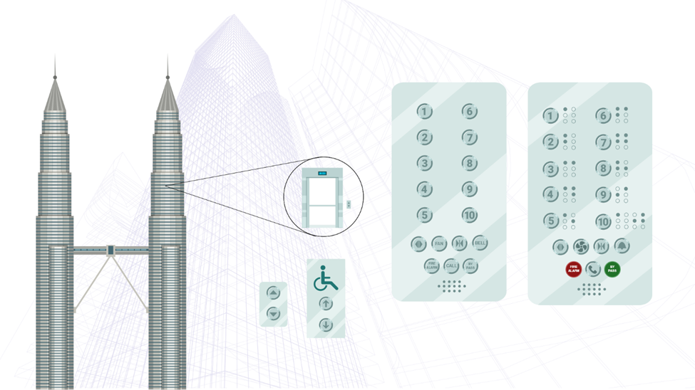
In a skyscraper, an experienced or trained individual can navigate the elevator buttons more quickly and efficiently than someone using them for the first time. Familiarity with the system, such as a destination control panel, makes it easier to operate—even if the panel contains numerous details—because the user already understands how it works and can anticipate the system’s responses.
In contrast, a new user might struggle without guidance or a precise pattern to help them locate their desired destination. For them, intuitive design elements, such as clear labeling or visual cues, make the process smoother and less overwhelming. This is why we must find balance when simplifying and excluding details in our designs.
Looking to achieve more with less in your UX?
Get in touch
Finding the Balance
Prioritize User Needs
To tend to user needs, first understand their goals and challenges through research and feedback. Then, design intuitive, efficient solutions tailored to their skill levels. Continuously improve the experience by testing, gathering input, and iterating on the design.
Clear Visual Hierarchy
Visual hierarchy is crucial as it first guides users’ attention to the most critical information, improving comprehension and ease of navigation. Prioritizing elements through size, color, and placement creates a clear flow and reduces cognitive overload. This enhances the user experience by making interactions more intuitive and efficient.
Provide Adequate Feedback
Interaction feedback and confirmation messages are vital for ensuring users understand the outcomes of their actions. Feedback, like visual or auditory cues, reassures users that the system is responding, preventing confusion or frustration. Confirmation messages validate necessary actions, helping to avoid errors and giving users confidence that their tasks have been completed successfully.
Ensure Accessibility
Ensuring accessibility is essential for creating inclusive experiences that allow all users, regardless of disabilities or limitations, to interact with a product or service. It promotes equal access, ensuring that people with varying abilities can navigate, understand, and use the interface effectively. Prioritizing accessibility not only meets legal standards but also improves the overall usability and reach of the design for a broader audience.
Balancing Aesthetics and Functionality
Balancing aesthetics and functionality is key to creating visually appealing and highly usable designs. Aesthetics enhances user engagement and makes products more enjoyable, while functionality ensures that the design meets users’ practical needs and goals. Striking the right balance means creating an attractive interface that doesn’t sacrifice ease of use, allowing both form and function to complement each other for an optimal user experience.
Focus on Brand Identity
Focusing on brand identity ensures consistency and recognition across all touchpoints. It helps build trust and familiarity by using cohesive visual elements, messaging, and tone that align with the brand’s values. By maintaining a strong and consistent brand identity, users can form deeper connections with the product or service, reinforcing loyalty and enhancing the overall user experience.
Contextual Relevance
Adapting to contextual relevance means tailoring content, design, and functionality based on the user’s current environment, needs, and behavior. This ensures that users receive information and options that are relevant and useful at the moment, improving the overall experience. Aligning the design with the user’s context, such as location, device, or task, enhances usability, personalization, and engagement.
Conclusion
There is always a better way to design—each iteration is an opportunity to refine, rethink, and improve until simplicity and functionality seamlessly meet. In design, clarity of aim is crucial since it will transfer into clarity of outcome. Complicated and bewildered designs betray a mind that is as complex and bewildered. If you’ve lost clarity by simplifying, you haven’t simplified.


